
Embrace Special Needs Ministry
The Embrace ministry, dedicated to serving children and adults with special needs at Fellowship Bible Church in Central Arkansas, recently received a new brand identity, a project completed in collaboration with designer Jenny Yancey. The centerpiece of the new look is an abstract letter 'e' constructed from various shapes, symbolizing the idea that all people are uniquely created for a special purpose. Combined with a palette of bright, fun colors, contemporary typography, and welcoming imagery, the complete brand creates an environment that is inclusive and welcoming to all.


Go-ToolsUSA
The branding for Go-ToolsUSA, a conceptual 'Unique and Innovative' startup tool company, is built on a foundation of strength and reliability. The central logo mark features an abstract nut or bolt—represented by a hexagon shape—that forms a chain link, symbolizing the durability and reliability of the company’s products. The chosen color palette resembles a traditional 'USA' scheme, utilizing blues, cream, and burgundy, with a distinct pop of green specifically included to represent the 'Go' in the company name. The entire identity uses a robust, san-serif typeface that further emphasizes the strength and quality of the brand.
TrapSync
As a Junior Graphic Design student at John Brown University, I participated in the Collaborative Design class, which groups graphic design, computer science, engineering, and business students to create a company and product from scratch. My team developed TrapSync, a brand for a humane, electronic, catch-and-release mousetrap. The resulting branding features a mouse integrated with an alert system (shown through exclamation points), utilizing a clean, sans-serif typeface and muted colors. This product ultimately won first place in the semester-end Collaborative Design competition.


Preschool Storytime
Created using basic shapes with fun colors, this Preschool Storytime branding was designed to capture the attention of young children.
This ministry at Fellowship Bible Church is a place for young kids to have a snack with friends, read a story, worship the Lord, and make a craft. The overall visual identity is cheerful, energetic, and completely kid-friendly.
Wonderful Provider
The Wonderful Provider retreat branding was designed specifically to capture the attention of middle-school students at Fellowship Bible Church. The core concept visually asserts that Jesus is the 'Bread of Life' by reimagining the iconic Wonder Bread logo. This familiar graphic is given a vintage feel through the use of deep, rich colors and subtle grain effects, lending a classic, textured look. Playing further into the theme, supporting imagery like custom bread tags were incorporated to reinforce the overall brand message.


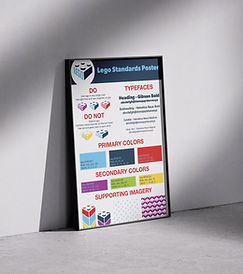

Lego Rebrand
This rebrand project focused on reimagining the logo for LEGO, a globally recognized and beloved brand. As a collective group, our primary strategic goal was to visually communicate that LEGO is relevant not just to children, but also to the growing community of adult builders and enthusiasts.
Following a thumbnailing process, the chosen mark was based on my concept. The idea behind this new logo was to bring the classic LEGO brick to life: a dimensional, 3D brick is created, with the brand name formed out of negative space. This innovative use of depth and form modernized the identity while maintaining instant recognition.
YWAM Holmsted Manor
During a study abroad, I along with nine other students traveled to England, where we had the pleasure of creating a logo and branding for YWAM Holmsted Manor. Each student presented a logo that they went through the ideation and thumbnailing process to create.
For my logo, I chose to create a door frame that embodied the idea of Holmsted Manor’s “open-door” policy, while keeping the medieval cottage feel of the manor.
For the logo that was chosen, designed by Heather Stanfield, I was able to design supporting imagery, including a tile pattern that was in the manor, using the shapes from her logo.


